A State of Flow
A State of Flow is a design concept created to optimise retail experience, by improving physical orientation for the duration of a customers journey. Creating a sense of movement throughout the shop floor with pattern, texture and form, the customer is guided between otherwise disparate areas. Key principles in neurobiology and psychology are applied to the field of interior design. Created with the beauty brand Aesop in mind aspects such as sustainable sourcing, classic simplicity and an earthy aesthetic are adopted in order to create space that is both functional and emotional.
“We see in order to move, we move in order to see”

“In everyday situations we are faced with a multitude of sensory inputs that compete for our attention and ultimately, for the control of our behavior”
In order to optimise retail experience first we must understand how customers interact with their physical environment and how design can influence human behaviour. Neurobiological studies suggest that the ideal way to initiate consumer interaction is by attracting their attention and more importantly, retaining this attention throughout the entire customer journey. Using a three tiered system; Orienting, Detecting and Alertness our designed environment can be intelligently engineered with attention in mind.
DESIGN STRATEGY
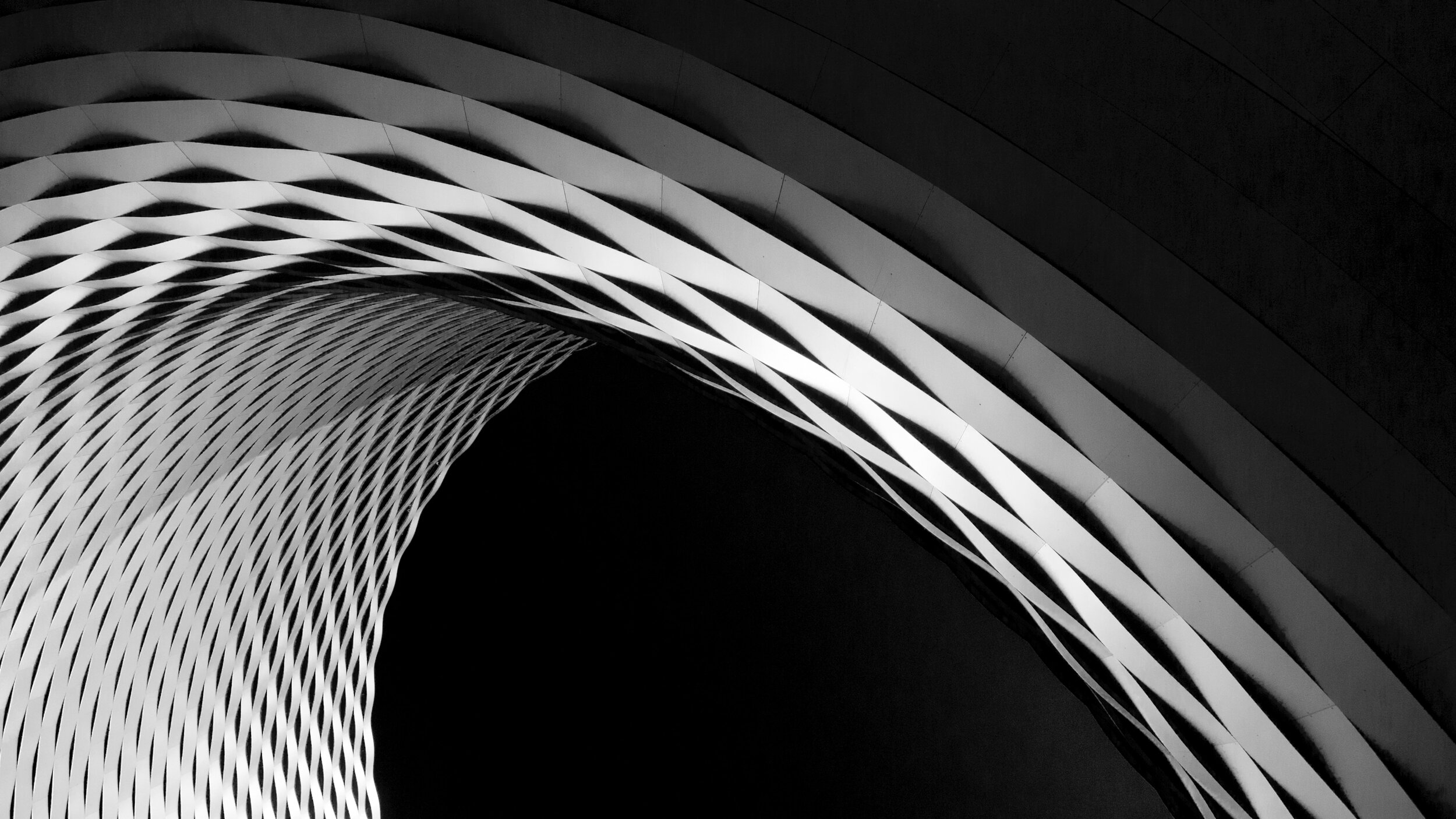
A State of Flow in an exploration of material pattern, structure and form. When scaled up and placed in an interior environment these material experiments are designed to visually and experientially facilitate the creation of ‘flow‘ throughout the store, reducing physical and emotional friction during movement and optimise customer experience. Key design features include;
Form
Uninterrupted and free flowing form is of paramount importance
Accent change is used in a subtle way to distinguish between areas
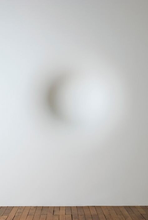
Colour
Low level paint and patina is adopted to create subtle colour differences
Colour and material gradation is utilised to negate any hard edges or jolted transitions
Material
By adopting the use of a base material palette a sense of unity is created across all areas and a design language is formed
A natural aesthetic is upheld throughout with raw material properties taking centre stage


BRAND IDENTITY
Sustainable Sourcing

Importance of Place

Classic Simplicity


CMF SOURCING
Materials are sourced with sustainability in mind with natural materials such as cork, wood and metals being used as the base material palette.
Material is chosen due to its locality. For a retail space to be built in Cornwall, materials such as copper are chosen due to its historical significance.
Material palette is left ‘earthy’ and simple with minimal processing techniques.
MOOD

CMF PALLETE


PATTERN AND PLACEMENT


FINAL SAMPLES


